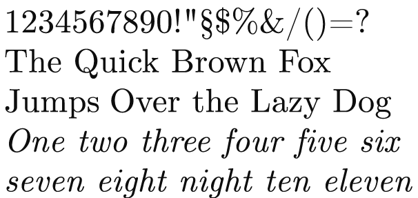
Computer Modern Serif Unicode, one of the ones I downloaded
Vitaly Friedman has been a very busy, busy guy. The last time, he compiled one of the awesomest list of free, quality fonts I've ever seen.
And now he's introducing another 19 more free, quality fonts to the world.
The results are listed below - the most beautiful fonts, created by the open-source community and free for personal, academic and (sometimes) commercial use. The disclaimers are changing from time to time, so you better first take a close look at disclaimer before using the font in a commercial project.Whoa. 19. I'm going to need a moment to try to calm down.
In the mean time, check them out yourself. 19 new fonts for your posters, labels, logos, DIY CD covers or anything that creative mind of yours can think of.
[ Smashing Magazine: 19 More Free Quality Fonts ]


6 comments:
ey rul hang ni gila font ka? hahaha.....
Jangan kecik ati tau, bukan apa aku cuma rasa pelik je. :P
It seem like you are really into this font thingy. Is it a writer instinct or something? hehe
Gila? Hmm, ada la kot sikit. Sebab kadang-kadang aku buat design untuk diagram, poster, label dsbnya. Jadi sentiasa font yang menarik dan bermutu.
Like I mentioned in the earlier posts, I've a new-found respect for the art of typography. I once had a difficult art teacher in Form 2 who made us painstakingly design a poster and adhere to typography rules, like proper spacing and so on. He was difficult (and a bit rude), but he was probably one of the best art teacher I ever had. I didn't appreciate the lessons he taught us until later, when I started looking at magazines and trying to replicate the designs onto Powerpoint slides and reading about typography.
I also want to stress that not all fonts are the same. I'm learning how to distinguish between the quality, well-designed ones from the rest. This is more important than whether it's pretty or not. There are factors like readability and legibilty to consider in evaluating a font. Fonts also help to communicate certain emotions and message, therefore learning how to pick a suitable font is another thing to learn.
This short documentary also helped spark my interest: Typography School.
And yeah, maybe you're right, it could be a writers' thing.
Aku nak tanya tentang satu perkara. Ada buku aku baca kata artikel yang ditulis dengan menggunakan font san serif lagi susah untuk difahami daripada artikel yg menggunakan font serif.
Tapi aku rasa yang tulisan dengan font tanpa ekor (san serif) nampak lagi kemas maka sepatutnya lagi senang utk dibaca dan seterusnya membuatkan hasil tulisan itu lagi mudah difahami. Tapi tak pernah pula aku buat eksperimen sendiri berkenaan hal ni.
Jadi hang ada tau apa-apa berkenaan hal ni tak?
Aku pun tak berapa tahu macam mana nak persoalan kau, sebab banyak pendapat yang aku dah dengar.
Tapi yang jadi amalan lazim font serif adalah untuk kandungan atau isi. Kalau kita tengok pun, buku dan majalah rata-rata menggunakan font serif untuk kandungan mereka. Mengikut sesetengah pendapat, font serif kurang meletih mata pembaca bagi teks yang panjang.
Satu lagi perkara yang kita boleh perhati, font serif biasanya digunakan untuk kandungan (perenggan, misalnya) dan font sans serif digunakan untuk benda lain seperti tajuk. Dengan ini, pembaca mudah untuk mengecam struktur sesebuah artikel, selain daripada untuk tujuan artistik.
Apapun, dalam menilaikan sesebuah set font, cuba perhatikan ciri-ciri seperti:
Readabilty refers to how well the letters interact to compose words, sentences and paragraph.
Legibility, how readily one letter can be distinguished from all another.
Seni font berasal dari alam percetakan, jadi orang yang mempunyai latar belakang dalam typografi, muka taip dan 'typesetting' sahaja yang mampu mengulas perkara dengan lebih panjang lebar. Aku cuma tahu sikit-sikit. Satu lagi, font pada komputer dipengaruhi oleh kualiti perkakasan paparan dan pencetak. Oleh sebab itu, satu font boleh nampak berbeza pada 2 komputer yang berlainan spesifikasi.
Wallahua'lam.
hmm dari pos hang di atas aku rasa mungkin fon serif dengan ekornya tu buatkan huruf lebih senang untuk dibezakan dan buatkan perkataan yang dibentuk menggunaan huruf dengan fon tersebut lebih senang untuk dibaca dan difahami. Apapun terima kasih untuk hang punya input.
Sama-sama kembali. Just trying to get people interested and to appreciate typography, and to look at fonts in a new way.
Post a Comment